Conducted UX research for NASA’s ARISA Labs, identifying accessibility gaps for users 55+, and informing design recommendations to improve usability on the Field Researcher Training Page.
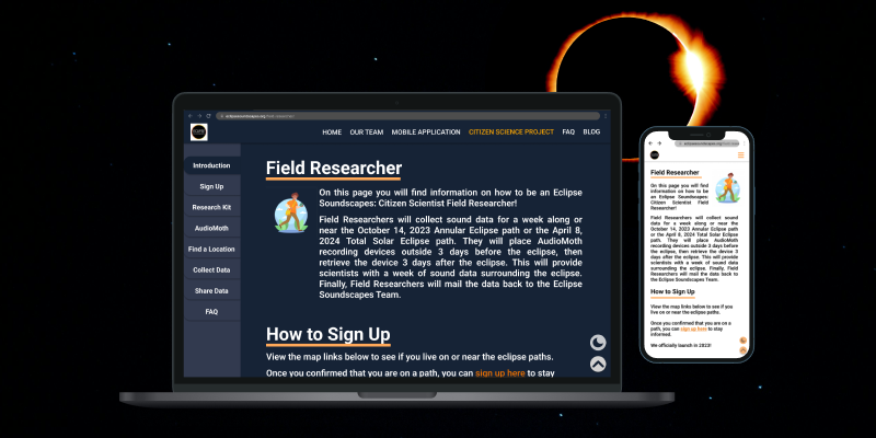
Eclipse Soundscapes is a project supported by NASA's Space Science Education Consortium (NSSEC). The project expands researchers' ability to study eclipse phenomena by providing everyday individuals with the equiptment to record the wildlife sounds in their area during the time of the eclipse.
Eclipses are generally known as a visual event, however, Eclipse Soundscapes sought to learn more about it's auditory impacts. This allowed them to deliver a multi-sensory experience that allowed everyone, including those who are visually impared, to witness the event.
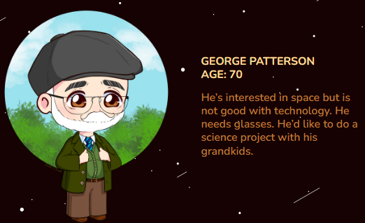
Our team was tasked with redesigning the Field Researcher Training Page (a hub for individuals who would like to collect data) to make it more accessible and appealing to users aged 55 and older.
The Eclipse Soundscapes Field Research Training Page's dark color scheme, jumpy navigation, and inconsistent content sizing makes it difficult to use and inaccessible to users aged 55+.
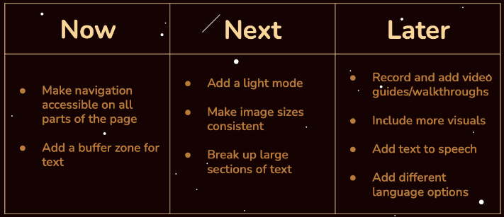
Provide the option of a separate color palette and update the text layout for accessibility and readability
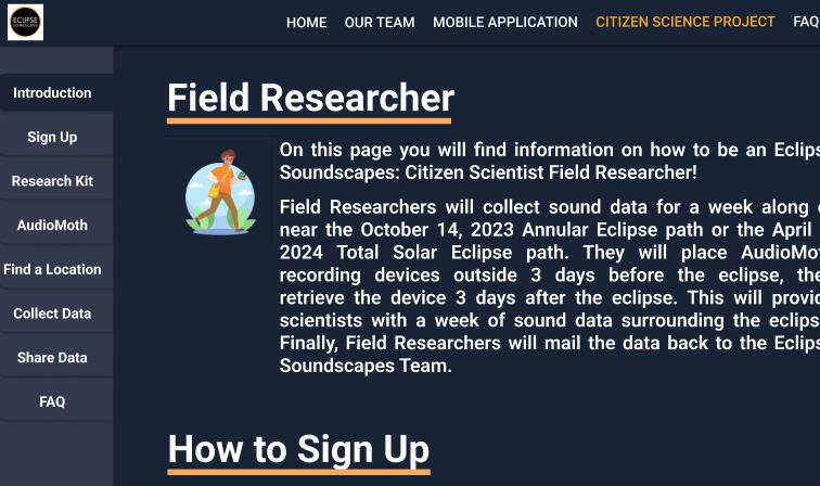
Build a lefthand navigation bar that will allow users to easily move between sections on the webpage
Create a unified visual identity for the website, with consistant image and video sizing
Our initial user research consisted of interviewing 12 potential users above the age of 55. We asked a series of questions before, during, and after having them interact with the original Field Researcher Training Page. The goals of these interviews were to learn about our research goals and test if our initial impressions/assumptions of the site were also experienced by our target users.
The approach for the user experience itself was based on the research conducted surrounding the needs and wants expressed by the community, and by following the prototyping goals to ensure that it met the expectations of the target audience and was a feasible solution to the problem.
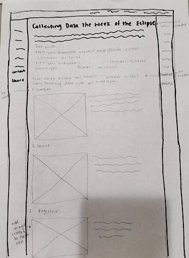
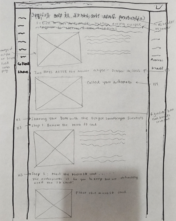
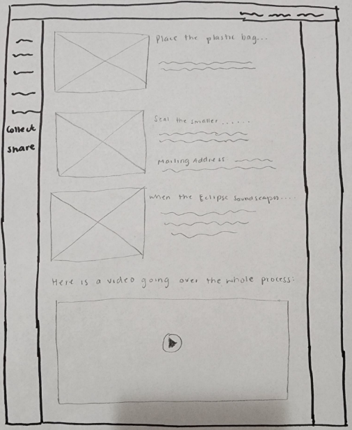
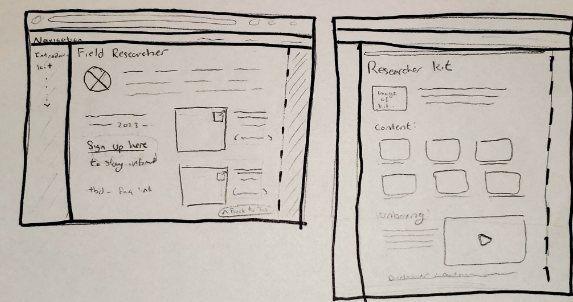
These sketches showcase the new layout for the Field Researcher Training Page. We wanted to ensure the walkthrough utilized more images and videos to allow users to follow along with visual steps as well as written. We also moved the navigation to the lefthand side to allow for easy page traversal.
These sketches highlight the updated overview section of the webpage, as well as the restructured content section with labelled images and consistent sizing.
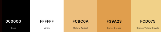
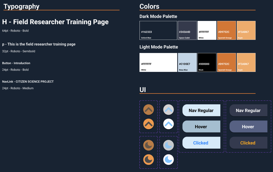
The original design system consisted of one font size and style for the entire webpage, along with the below color palette. Our team worked on creating a new design system with updated components, varied font sizing and styling, and light/dark mode color palette styles for improved accessibility.
Putting together everything that was learned, we were able to create a high fidelity prototype of the Field Researcher Training Page which would reflect the needs of our 55+ users. We also tested and iterated based on user feedback during the weeks we were designing.
Changed the navigation from jump-to links at the top of the page to a functional sidebar for easy access from all sections.
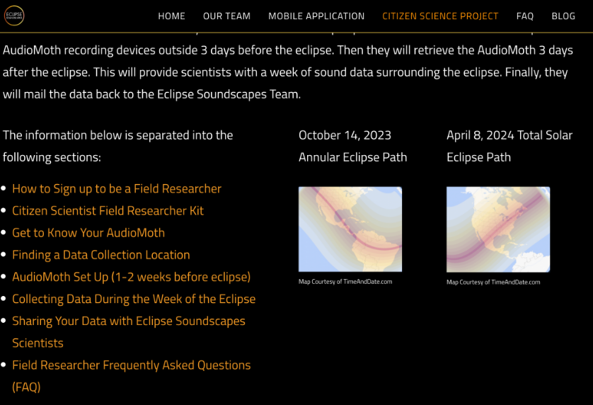
Created a stationary "Back to Top" button in the bottom right corner of the page and removed the separate buttons from the ends of each section.

Through this project, I was able to conduct in-depth user research and redesign Eclipse Soundscapes Field Research Training Page through prototyping with both low and high fidelity wireframes to help form an accessible and usable interface for users aged 55+.
It was fun working on user research with a group rather than solo because I was able to learn new design styles, Figma interactions, user aquisition methods, and more from them.
Thanks to this partnered redesign of NASA's ARISA Labs Eclipse Soundscapes Field Researcher Training Page, I feel more confident in interviewing users, assessing user experiences, and prototyping interfaces with Figma.
Future iterations would include performing user testing to assess whether or not the prototype design is accessible to even wider audiences such as those fully visually impared or using screen readers. We would also cnsider removing all floating elements and re-working image, videos, and navigation to be more accessible.
Since this was a tag-team user research project from the client with multiple teams working on different site demographics, it is up to the client's discretion on which suggestions they want to implement.
Crafting digital experiences that blend creativity with functionality. Specializing in UI/UX design and interaction design.