Followed the Design Thinking Process to research the Goodreads community and reimagine the book-page layout to favor simplicity and ease of use.
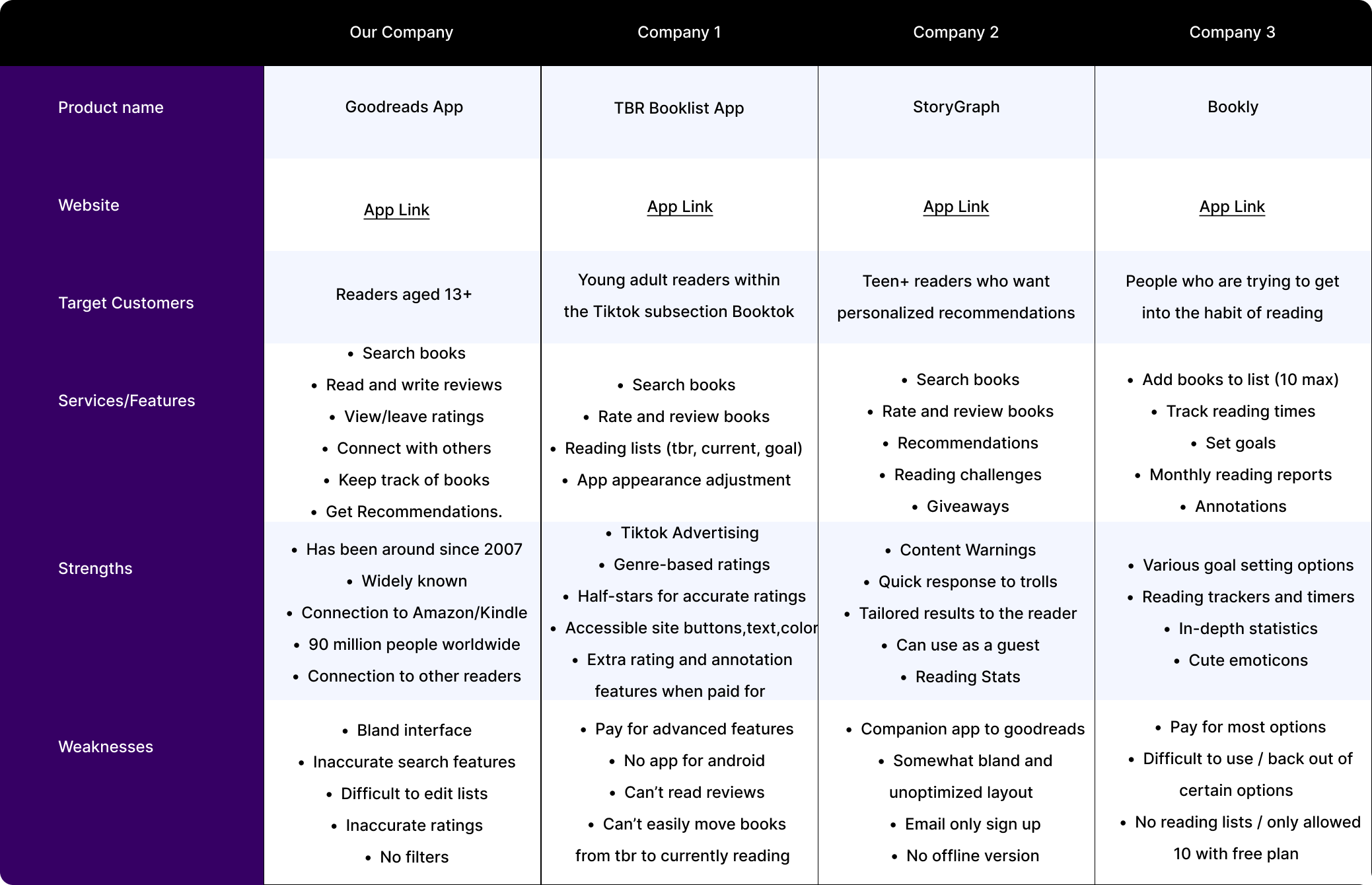
Goodreads is the world’s largest site for readers and book recommendations. It was first launched in 2007 and has gained 125 million users as of 2022.
Despite being the largest site for readers, the app has not been updated in some time, as shown through the outdated interface and lack of accessibility considerations for users with sensory processing disorders, trauma disorders, and screenreaders.
These issues were identified due to the presence of moving images close to text within comment sections, the nonexistent content warnings for books with common traumatic themes, and the lack of alternative text when it came to pictures, images, and icons.
The Goodreads App for Android is not accessible to those with senory processing disorders, ptsd, cptsd, other trauma disorders, or to those with screenreaders due to it's lack of customizability, content warnings, and layout.
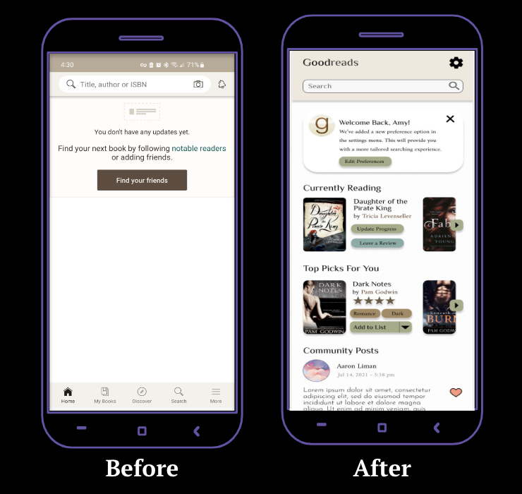
Create a customized home page for users with updates, community engagement, and personalized content
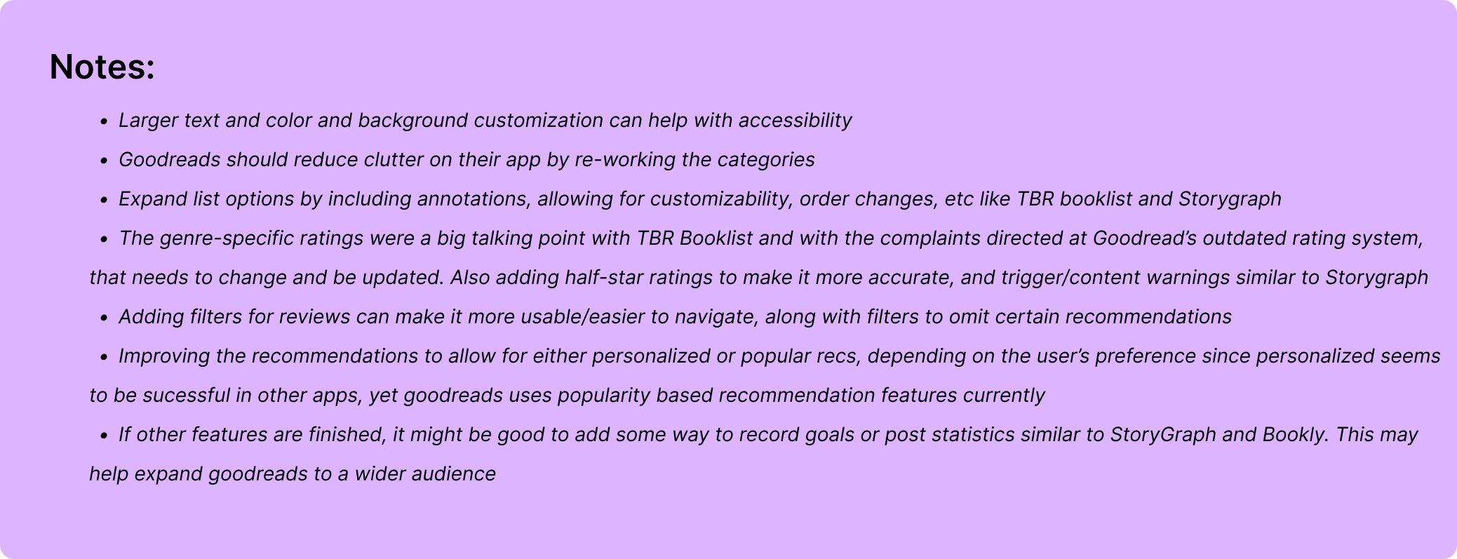
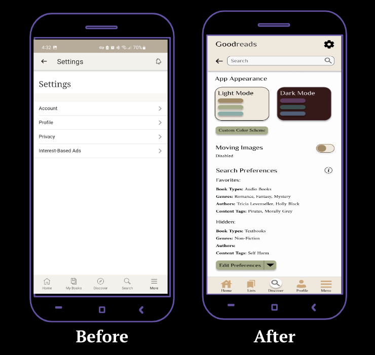
Add new interface settings to adjust text sizing, colors, moving images, and more to accommodate all users regardless of ability
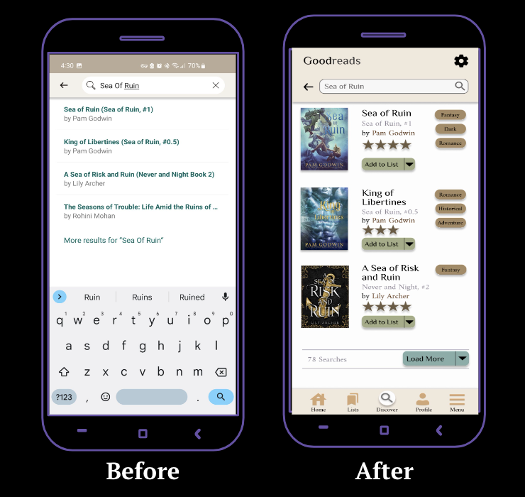
Include community reactions to content outside of general genres, and spoiler warnings on reviews
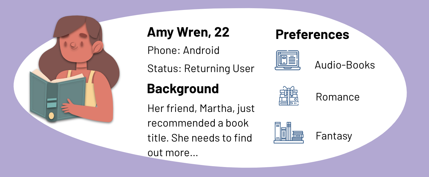
To learn about users' personal experiences with discovering books and Goodreads, I conducted user interviews. I interviewed 15 people between the ages of 18-25, for about 15-20 minutes each, asking open-ended questions to learn as much as possible about Goodreads's users and their experiences. These are the main takeaways from the interviews:
The following are accessibility-related issues being encountered by Goodreads users, which will be taken into consideration during the design phase:

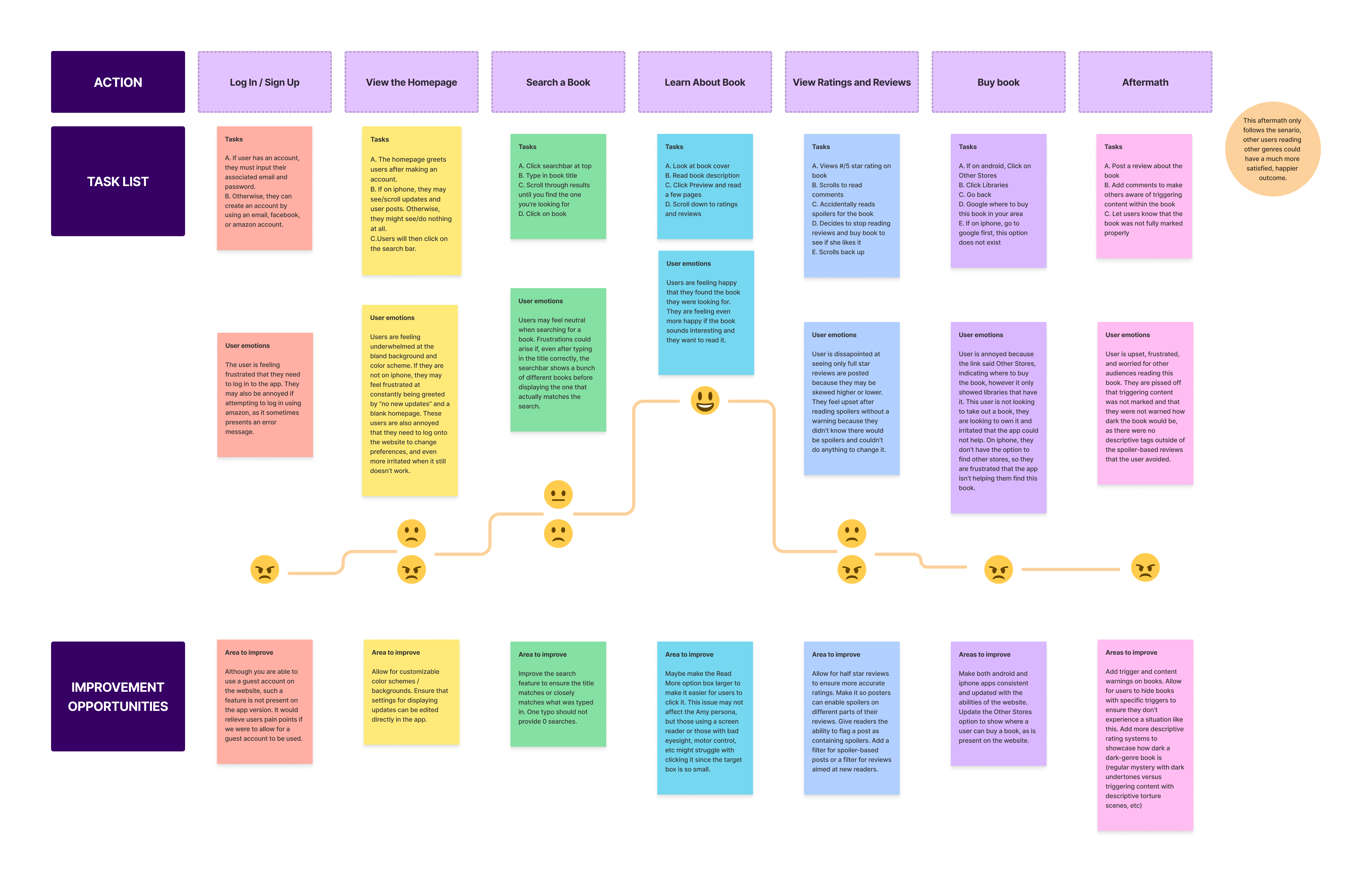
The approach for the user experience itself was based on the research conducted surrounding the needs and wants expressed by the community, and by following the prototyping goals to ensure that it met the expectations of the target audience and was a feasible solution to the problem.
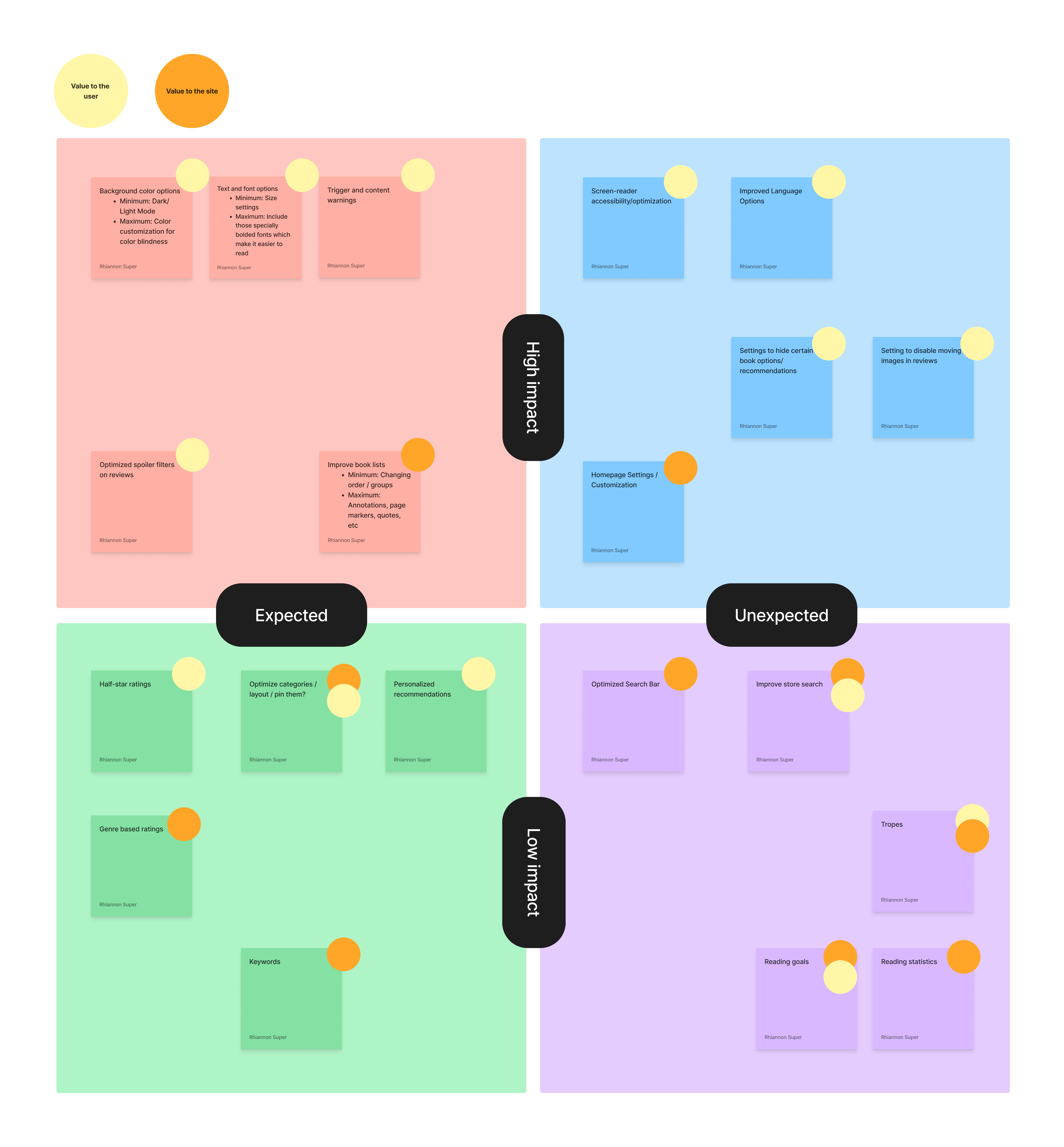
After brainstorming different ways to achieve user needs and goals, a list of potential app features was created. By utilizing a 2x2 matrix, these features were sorted based on relevency and impact.
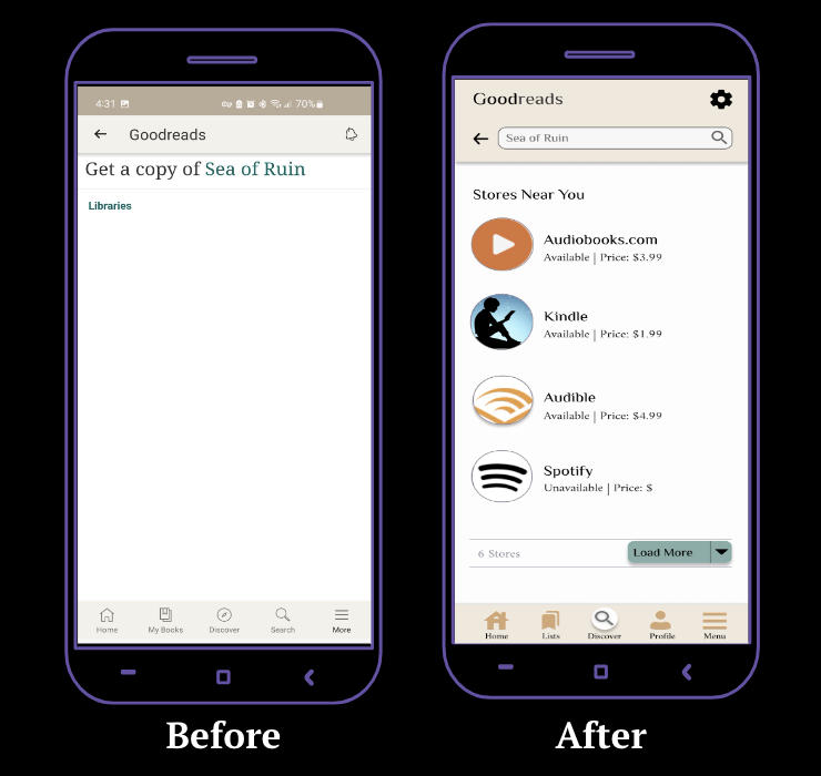
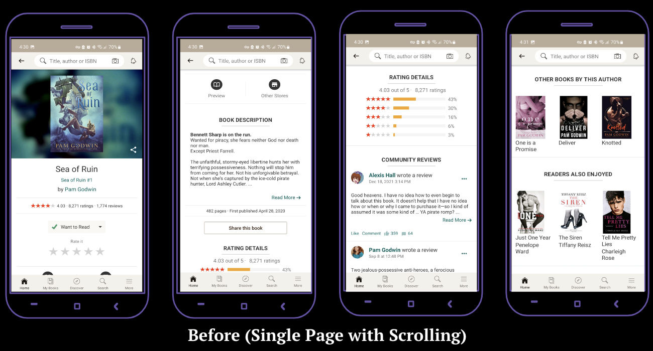
This application map aims to follow the reimagined Goodreads site using prioritized features at their most basic level (minimum viable for use). While creating the map, it was noted that the app had many branching and crossing pathways, which opened too many options for users to click on. This caused excess clutter on the application and difficulty for users. This map eliminated some of those routes in hopes of creating a better user experience.

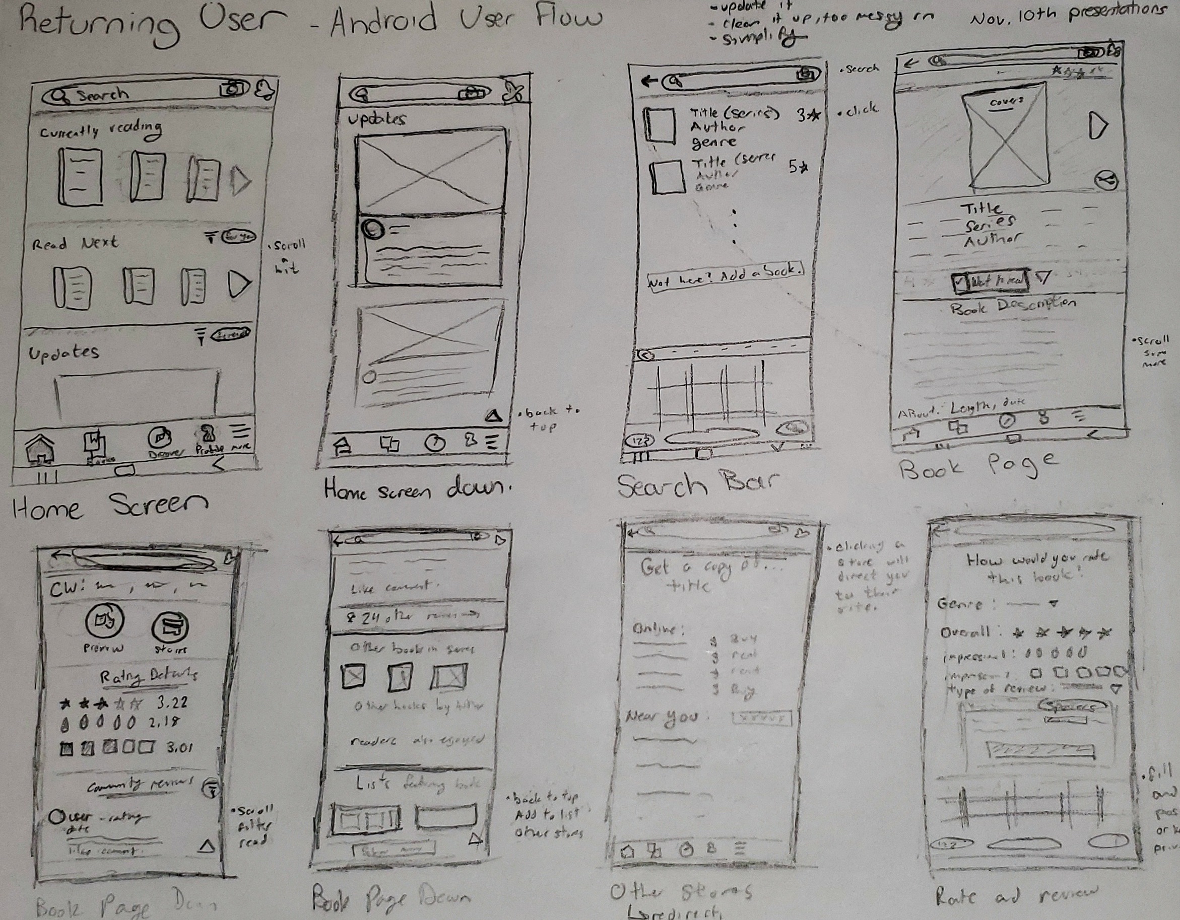
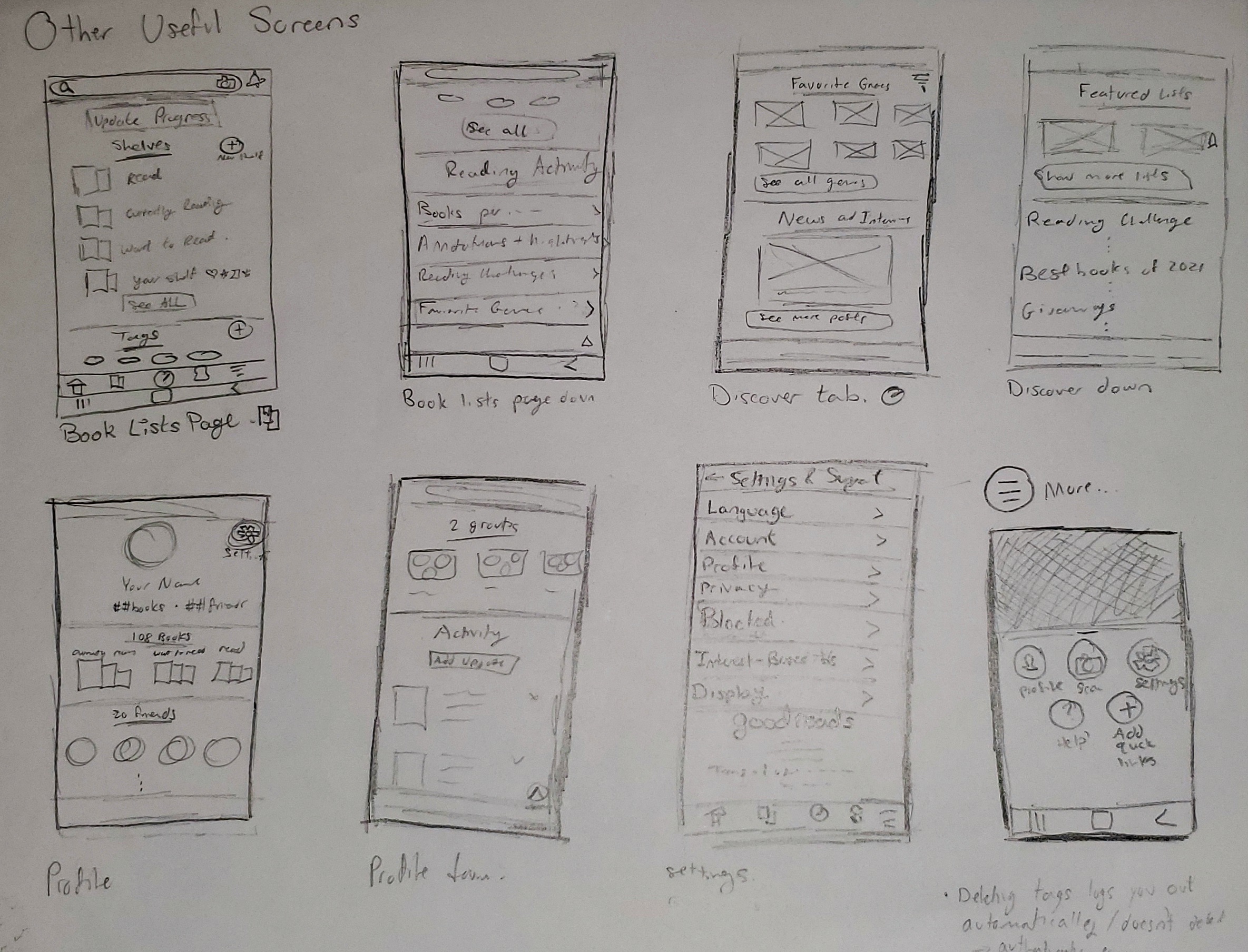
Putting together everything that was learned, I was able to create some low fidelity wireframe sketches which would allow me to visualize a final rendition and make informed decisions on how to design the different screens and features that would help our users fulfill their needs and meet their goals.
After 2 rounds of usability testing via In-person, moderated assessments, feedback was implemented to the high fidelity wireframes to create the final solution.
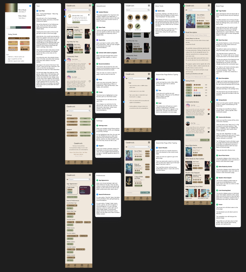
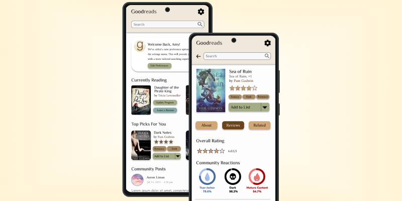
First iteration of the updated Goodreads screens
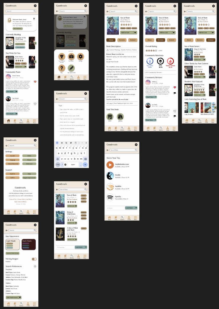
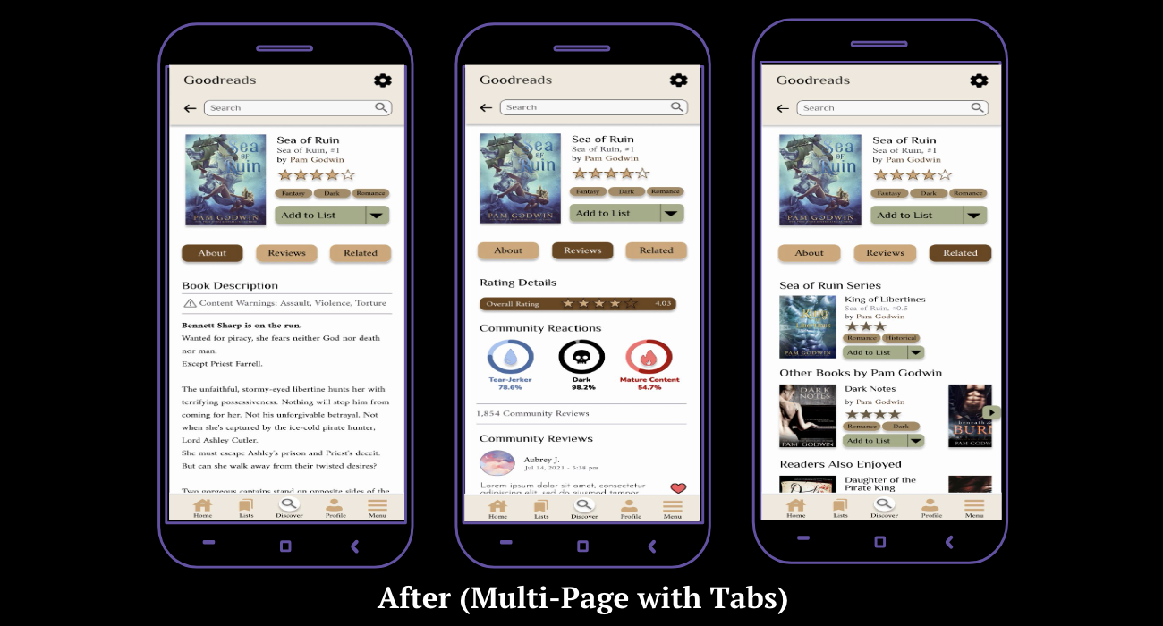
Final iteration of the updated Goodreads screens

Through this project, I was able to conduct in-depth user interviews, collect data, create user flows, empathize using journey mapping, compile information architecture through a site map, and iterate on my designs to form an accessible and usable interface for Goodreads' book page.
As someone who tends to focus more on user experience research than user interface design, I encountered and overcame challenges during this project when it came to creating the different features, laying out the various screens, and navigating through Figma's platform.
Thanks to this unsolicited redesign of the Goodreads interface, I feel more confident in using Figma, designing user interfaces, and translating my ideas from lists into visuals.
Future iterations would include re-testing using the final prototype and make necessary edits after performing usability testing with at least 15 more users.
Crafting digital experiences that blend creativity with functionality. Specializing in UI/UX design and interaction design.