
Led end-to-end product design for an ed-tech startup, redesigning mobile and web platforms, building a scalable design system, and supporting the product from concept to launch across a multi-platform ecosystem.
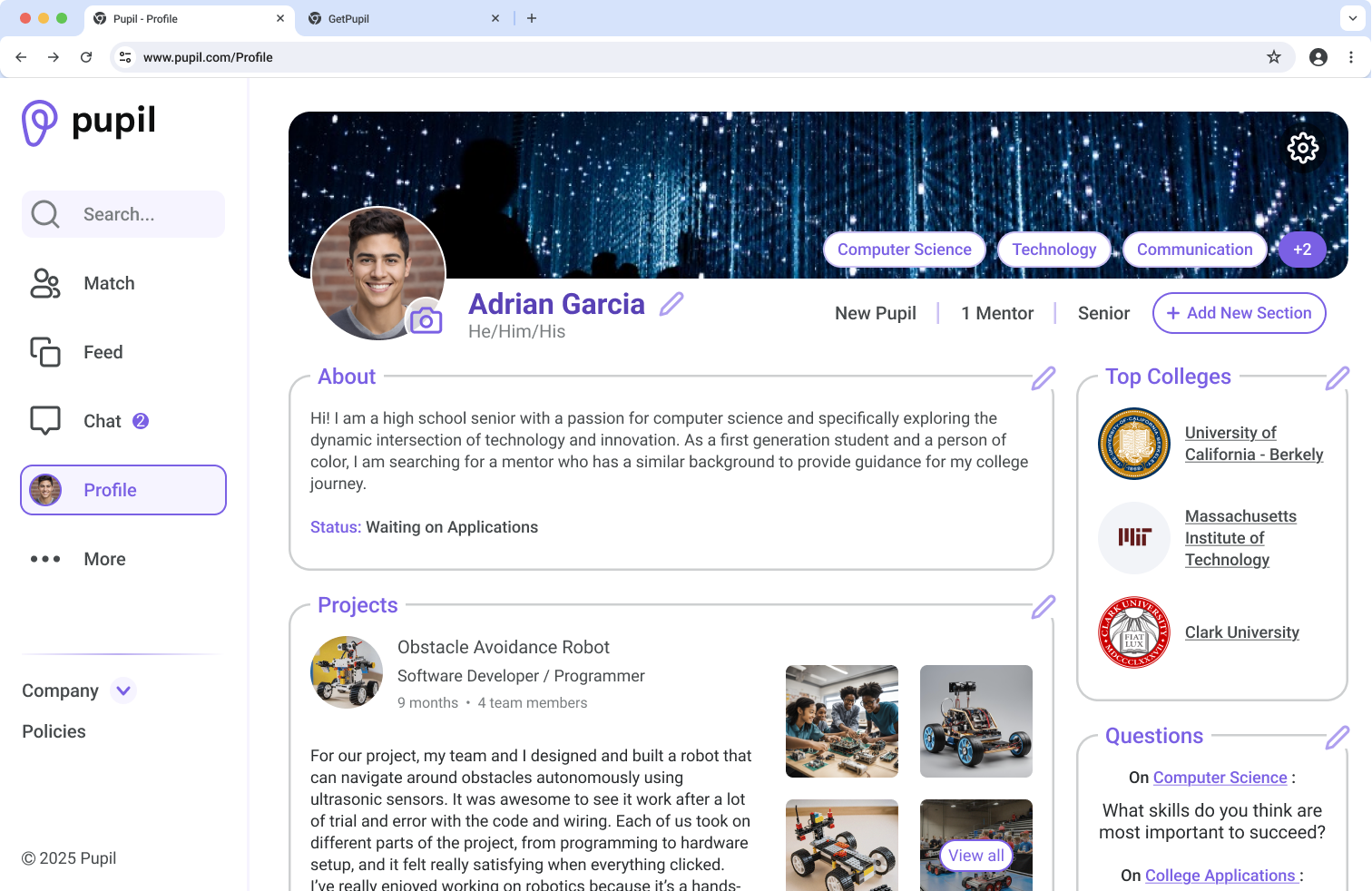
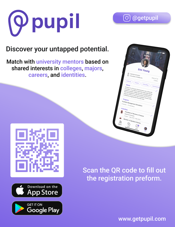
Pupil is an ed-tech startup connecting high school students with mentors to support college and career planning.
As the product grew, the platform became fragmented across mobile, web, and marketing, creating usability issues, inconsistent design patterns, and challenges for engineering implementation.
Despite a strong concept and solid business connections, as the product scaled, inconsistent design patterns, lack of a unified system, and poor accessibility created friction for both users and engineers. This led to decreased usability, slower development, and difficulty maintaining a cohesive experience across platforms.
This project focused on modernizing Pupil’s app, design system, and workflow to create a more cohesive, inclusive, and scalable product experience.
Enhance navigation, accessibility, and user engagement through thoughtful UX improvements
Build reusable components and guidelines to enable consistent future growth
Create a unified visual identity spanning the mobile app, website, and marketing materials
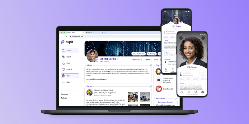
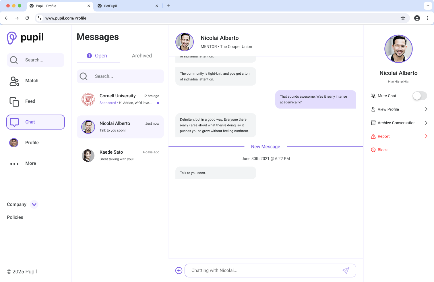
Completely redesigned Pupil's mobile interface to enhance clarity, engagement, and accessibility, aligning it with the refreshed brand direction. Also took into consideration new constraints such as usage limits, paid plans, and sponsor requirements.
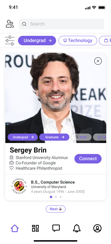
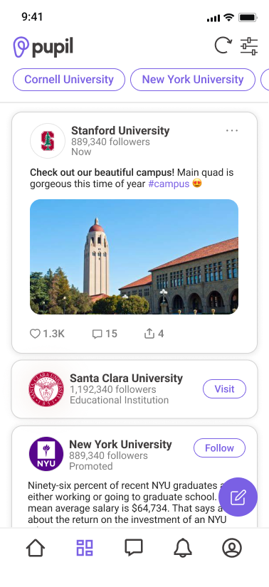
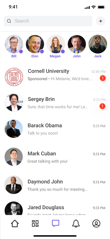
The original Pupil app was organized into five primary navigation sections—Mentor/Mentee Matching, Feed, Messaging, Notifications, and Profile. However, inconsistent navigation patterns and a lack of visual hierarchy made the app difficult to navigate. Without a defined design system, clickable elements were often unclear, and the overall interface no longer reflected a modern, scalable product experience.
My design strategy for this project was to start with the larger issues, such as navigation and brand identity, then move on to the more detailed interactions and technical items. I worked on modernizing the look and feel of the app while still keeping it friendly and usable for younger mentees, improving upon accessibility, labelling, and visual cues, as well as reducing the amount of actions users needed to take throughout the app.


Although my time on the project concluded with the mobile app’s release on the App Store, I outlined several key features for future designers to expand upon. These included:
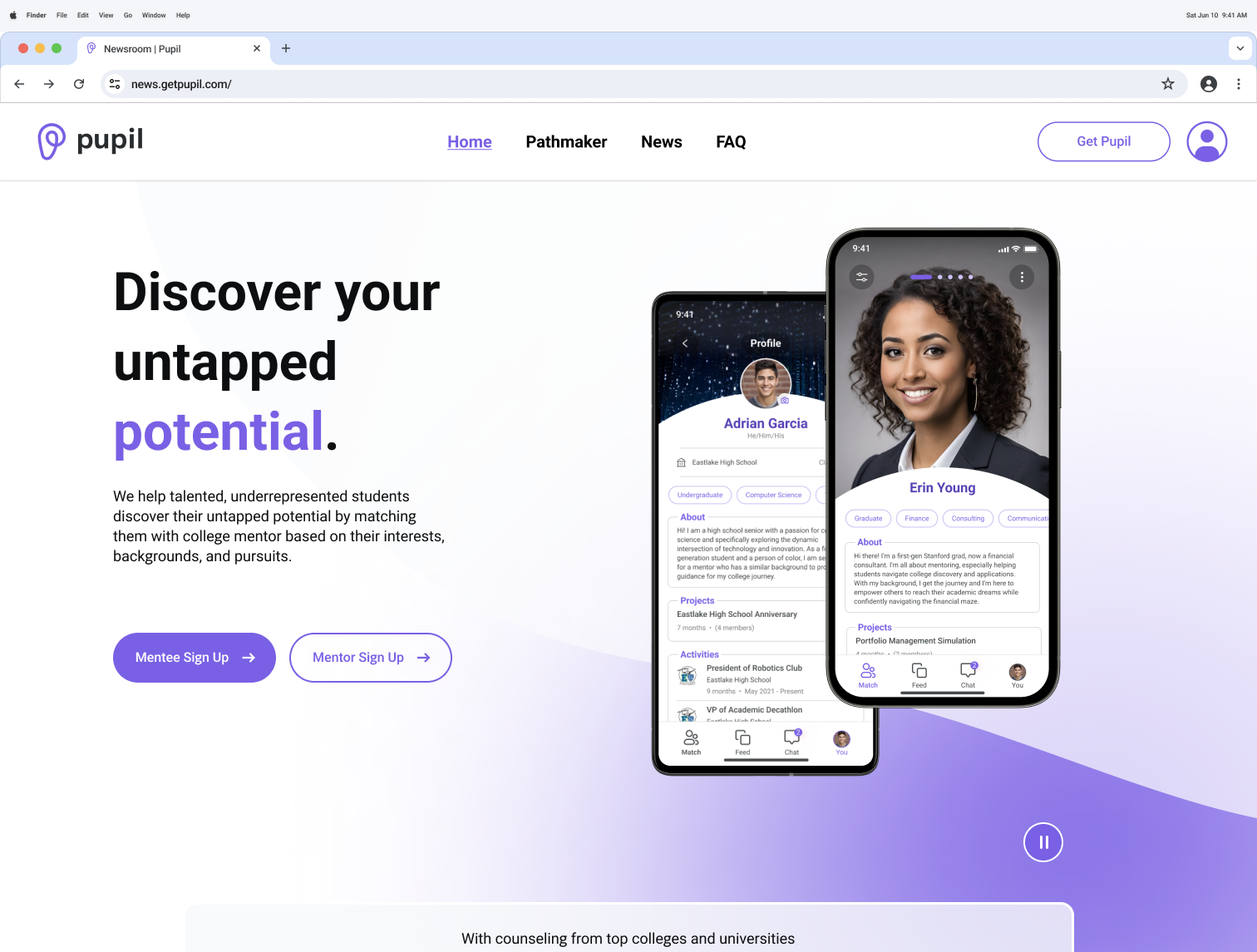
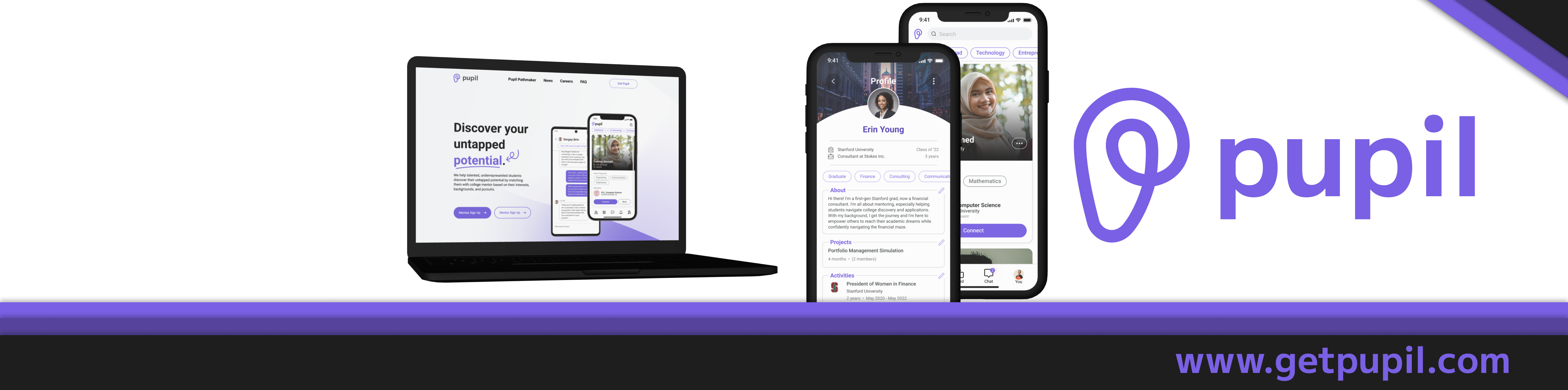
Redesigned Pupil’s web app to reflect the mobile experience, prioritizing accessibility, usability, and consistency through the shared design system.
The original web app was in an early, bare-bones state, with only core screens and basic navigation implemented. Because it closely mirrored the initial mobile experience, key interaction patterns, accessibility considerations, and brand consistency had not yet been fully addressed. As a result, many of the usability and navigation challenges present in the mobile app carried over to the web platform.
Building on the mobile redesign, I first refined navigation and brand consistency before addressing more complex web-specific interactions. Rather than duplicating the mobile experience, I restructured Pupil into a desktop-friendly web app with a modern interface and user-tested interaction patterns.
With additional time, I would further refine interaction details and conduct expanded user testing to validate key flows across desktop use cases. As new features continue to be developed for the platform, adapting them thoughtfully to the web experience would be a natural next step. I was particularly interested in exploring desktop-friendly alternatives to the swipe-to-connect interaction in the Mentor/Mentee Matching flow, as similar patterns in dating apps often face challenges when translated to non-touch interfaces.
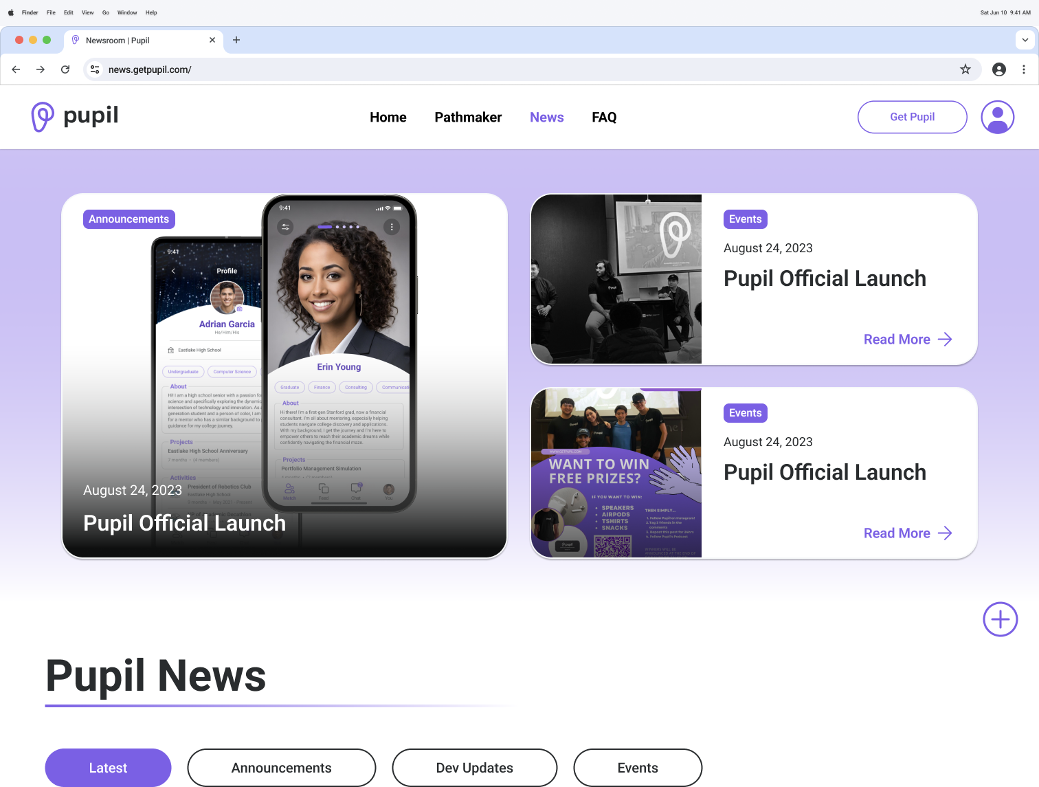
Oversaw the redesign of Pupil’s website and personally designed the News Page. Ensured consistency with the mobile experience through shared components from the design system.
Pupil’s marketing website was designed to attract new users, share company and product updates, and highlight partnerships with external organizations. However, usability issues such as broken or dead-end links, inconsistent navigation, and a lack of optimization for the app’s post-launch state limited its effectiveness as a marketing and onboarding tool.
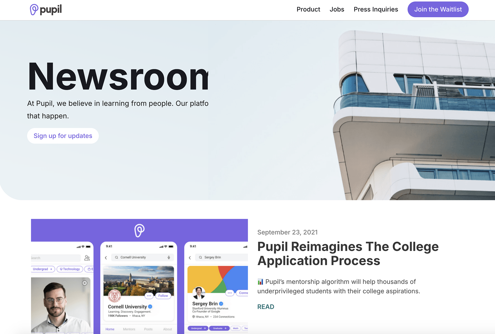
For the website redesign, I led and mentored a product design intern as they worked on the homepage as their first major project at Pupil. I guided the development of updated navigation, responsive and interactive layouts, and a more modern visual interface. In parallel, I designed the structural framework for the redesigned News page, improving content discoverability for users while enabling the marketing team to publish updates more efficiently.
At launch, the marketing website met all core goals. As the product grows, future iterations could bring events and key updates directly to the homepage to improve visibility and engagement. I would also continue refining the News page by expanding content structure and highlighting relevant articles and updates more effectively.
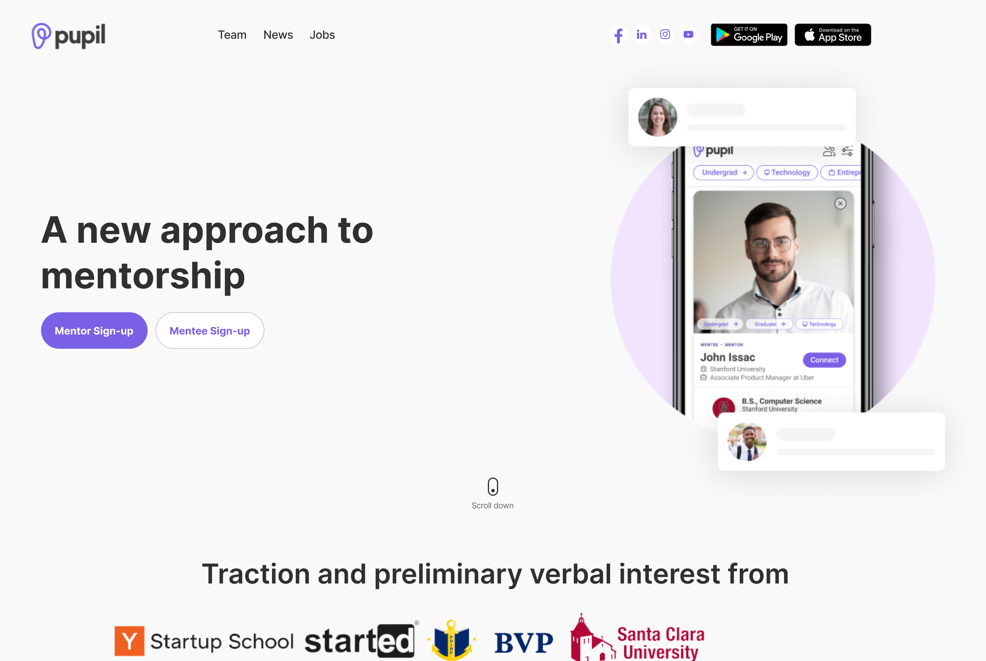
Evolved Pupil’s brand identity to reflect a more modern, approachable, and inclusive design.


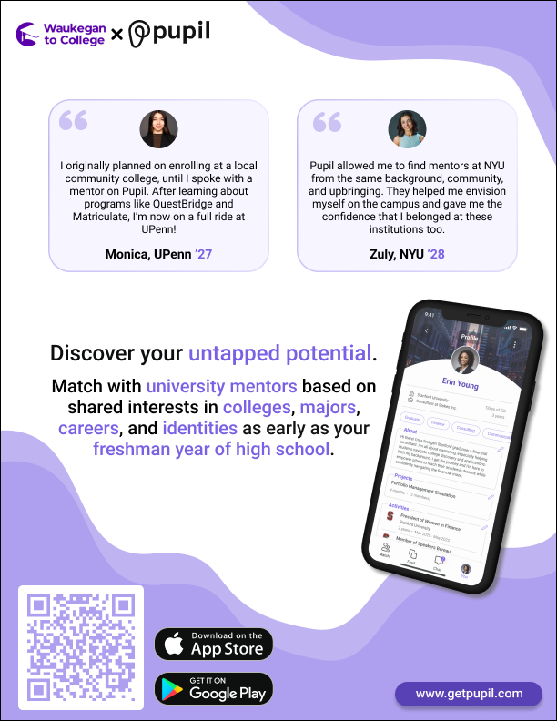
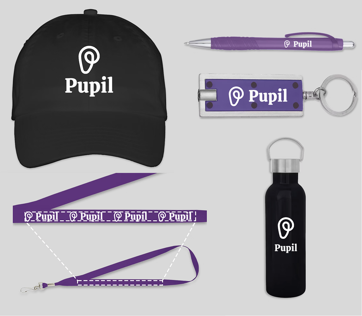
Extended the refreshed brand identity into marketing assets, including social media banners, event posters, and physical product mockups to strengthen brand cohesion and user outreach.
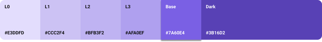
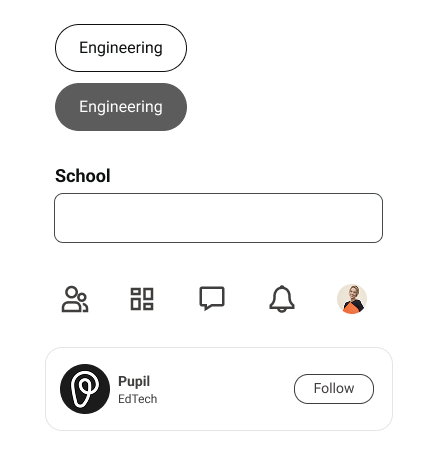
Developed a modular design system in Figma to unify brand, mobile, and web assets. Etablished clear component guidelines and scalable patterns that could be used across various project files.
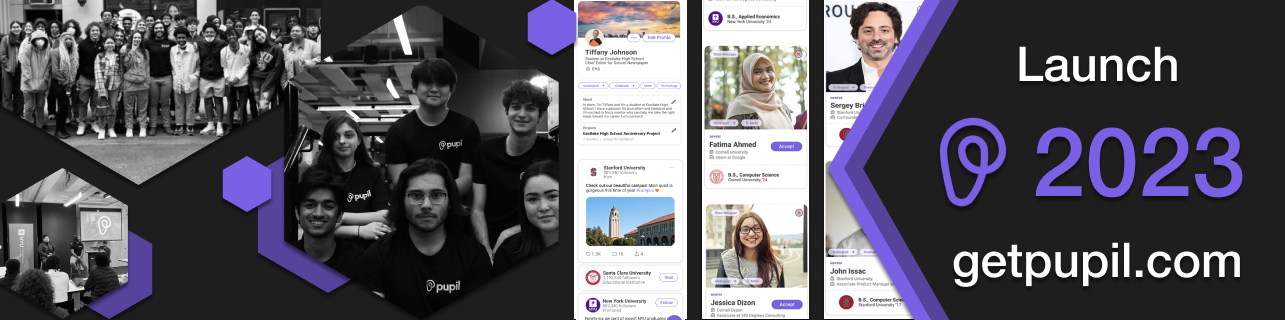
Recruited mentees to participate in beta testing sessions. Their feedback guided usability improvements, accessibility enhancements, and user flow refinements. Also mentored 4 product design interns throughout my time at Pupil, giving them real-world experience with user research and professional product design standards.
This long-term project strengthened my ability to lead cross-functional teams, merge UX and brand strategy, and bring consistency to every user touchpoint.
Crafting digital experiences that blend creativity with functionality. Specializing in UI/UX design and interaction design.
.svg)